Sri Sri Tattva

Sri Sri Tattva

Ayurveda, an ancient holistic medicine system from India, focuses on achieving balance between mind, body, and spirit. It offers personalized treatments based on individual dosha types (Vata, Pitta, Kapha), emphasizing natural remedies, nutritious diets, and balanced lifestyles. With practices like yoga and detoxification therapies, Ayurveda promotes overall well-being and preventive care, making it a globally recognized approach for natural health and healing.

What I did

Website Redesigned

My Role

Product Designer

Timeline

Oct - Dec 2023

Team

2 Product Designers, 1 PM, 2+ Engineers and more

Tools

Figma

Disciplines

Human Interface Design

Prototyping

Scalable Components

What did I do?

Research

Strategy

Copy writing

Wireframing

Visual Design

Prototyping

Testing

Project Timeline

Research and Idea Explorations

Stakeholder feedback & Usability Testing

Usability Testing

Prototyping and Iterations

Prototyping & Iterations

Development

PROLOGUE

Ayur

veda

is practiced worldwide

Ayurveda, an ancient holistic medicine system from India, focuses on achieving balance between mind, body, and spirit. It offers personalized treatments based on individual dosha types (Vata, Pitta, Kapha), emphasizing natural remedies, nutritious diets, and balanced lifestyles. With practices like yoga and detoxification therapies, Ayurveda promotes overall well-being and preventive care, making it a globally recognized approach for natural health and healing.

How Sri Sri Tattva come into picture?
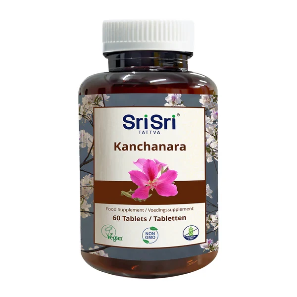
Sri Sri Tattva is a 40-year-old health and wellness company with a worldwide presence. Based on the authentic and timeless wisdom of Ayurveda, they bring people personalized nutrition and wellness solutions, by offering a wide range of natural products and services.

Trust and authority

Wider range of products

Positive Health Outcomes

User Interaction

" The buttons are too small, pages load slowly, and some features just don't work properly, making it hard for me to browse "

" A lot of times I have faced this issue of not able to change the language of the website and the button to do so is not clearly visible "

" I often see the details about ingredients, how to use the products, and their health benefits, but the descriptions are often too limited for me to make informed decisions."

To view full case study, open this in web!

To Discuss further about the project, reach out to me at

Interesting Insignts

Health-Conscious Professional

Navigational confusion

Insufficient information

Time consuming

Spiritual Seeker

Limited product details

Informed purchase decisions

Reliance on other sources

Conscious Consumer

Negatively impacting perception

Mobile responsiveness

How we decided the colour Palatte

Based on our interviews, users experienced issues with the website's navigation, clarity, and overall user experience, feeling it was more focused on selling products than on their needs. To address this, we chose a light, nature-inspired theme for the website that aligns with the principles of Ayurveda and the company’s brand values. We believed this approach will enhance user engagement, making it easier for customers to explore the site and ultimately drive more sales.

Primary Colours

#69AD5E

#B5A787

#282D56

Secondary Colours

#EFFFEA

#EFFFEA

Fonts

DM Sans

Petrona

DECIDING FACTORS

Mostly People who love Ayurvedic products prioritize natural, holistic approaches to health and wellness. By incorporating earthy tones and natural hues, we aim to evoke a sense of harmony and connection to nature, aligning seamlessly with their holistic lifestyle choices. These colors not only reflect the essence of Ayurveda but also complement our brand colors, subtly reinforcing our identity while enhancing the overall user experience.

Ability to drive New and Dormant users

Brand identity focus

Improvements

Redesigned Website

Before

After

HOMEPAGE

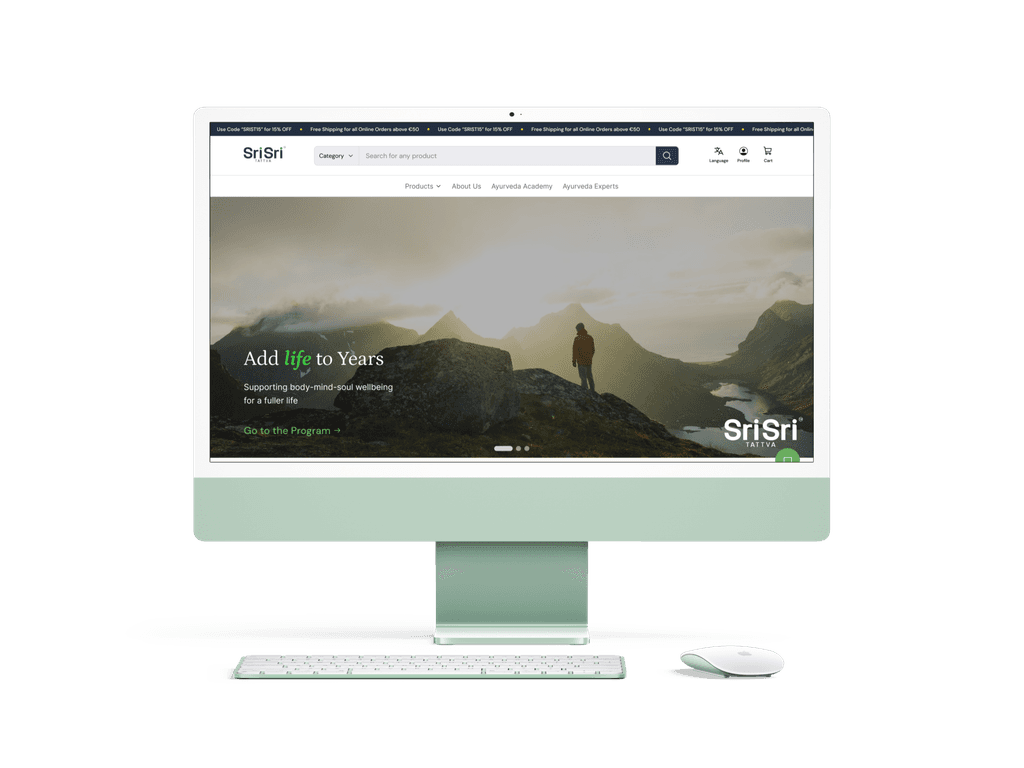
Users face several issues with the current homepage: a cluttered layout and confusing navigation make it hard to find products, slow load times lead to impatience, insufficient product information affects buying decisions, and poor visual design fails to convey the brand's holistic, natural ethos.

IMPROVEMENTS

  1. Better top navigation bar

  1. Easy-to-access options (cart, profile)

  1. Interactive slideshow showcasing brand offerings

  1. Sticky chat hover button for real-time assistance

Before

After

PRODUCT PAGE

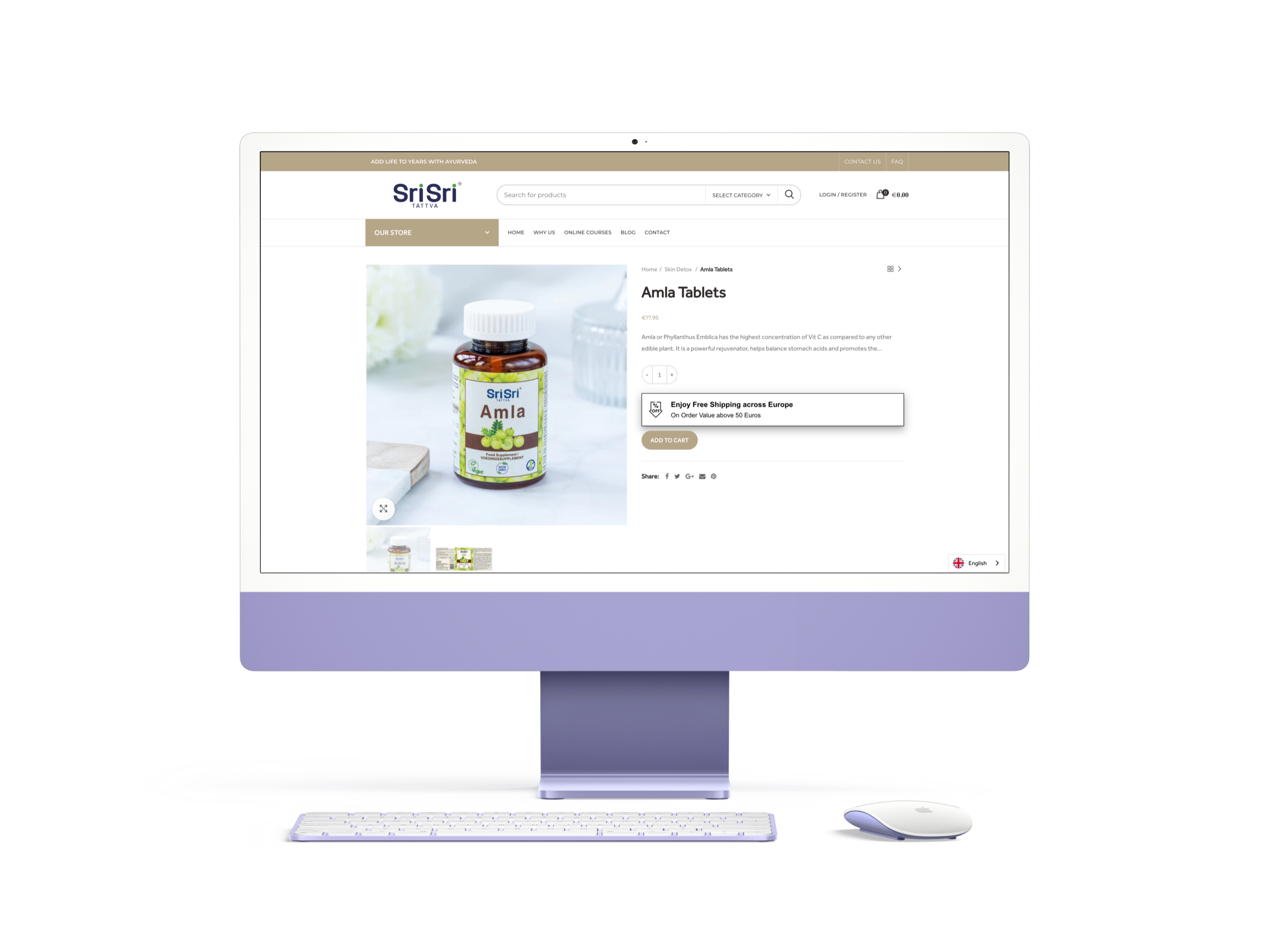
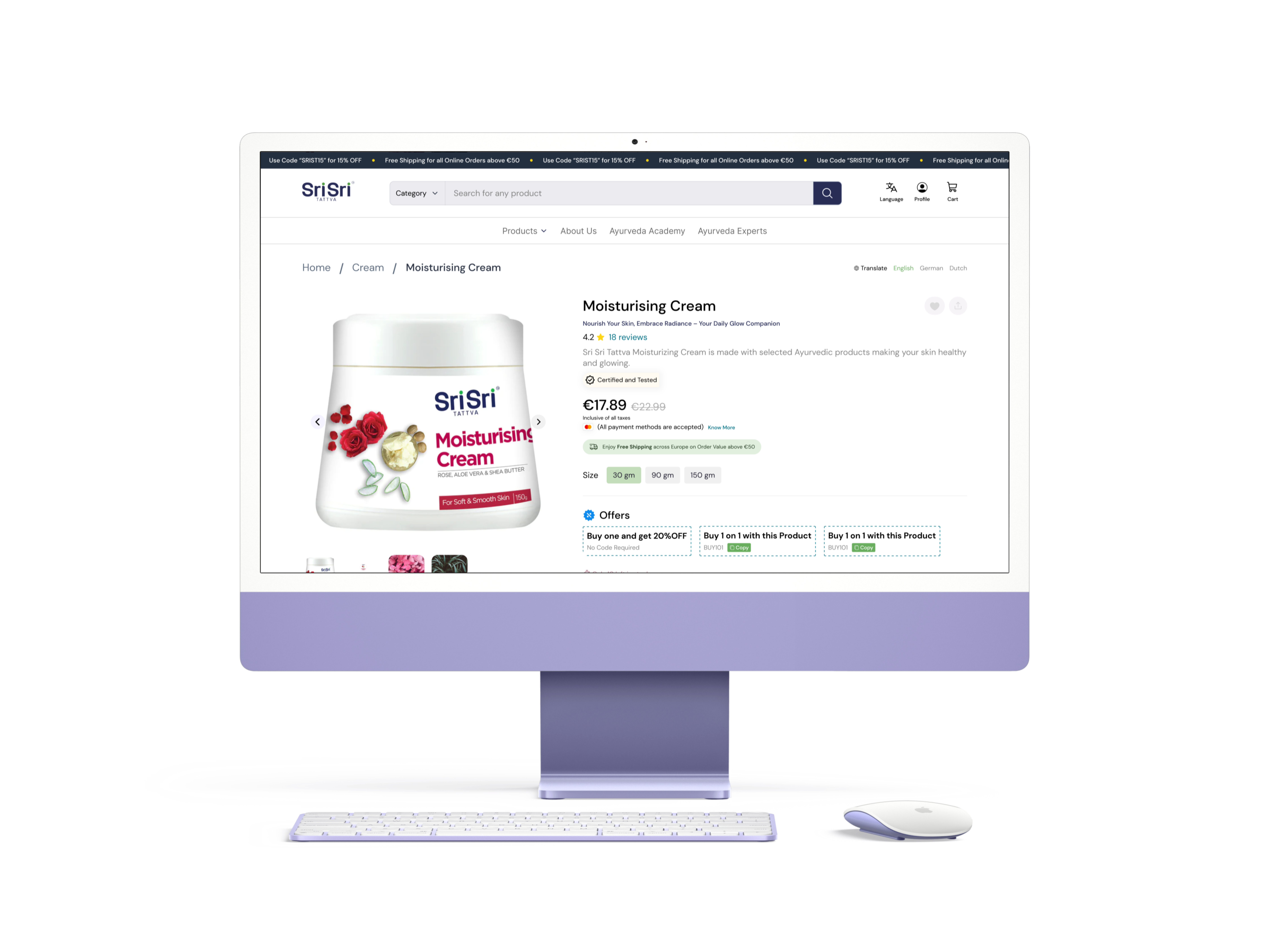
Users face several issues with the current product page: limited product information, poor image quality, non-intuitive layout, lack of customer reviews, slow page load times, a complicated add-to-cart process, inadequate filtering options, and the absence of related product suggestions.

IMPROVEMENTS

  1. Detailed Product Information

  1. User-Friendly Layout

  1. Customer Reviews

  1. Related Product Suggestions

( At the end of the screen)

Before

After

CART PAGE

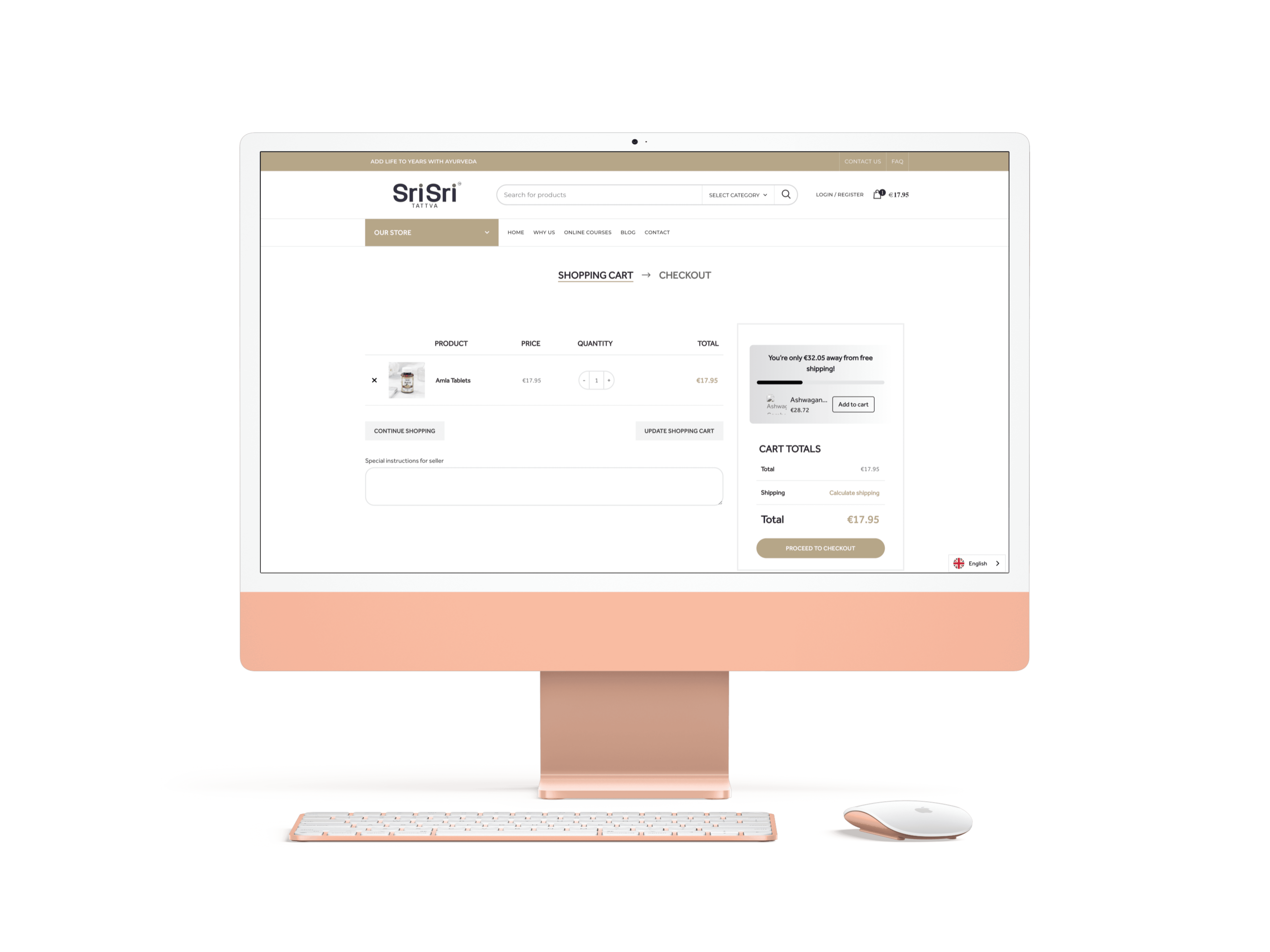
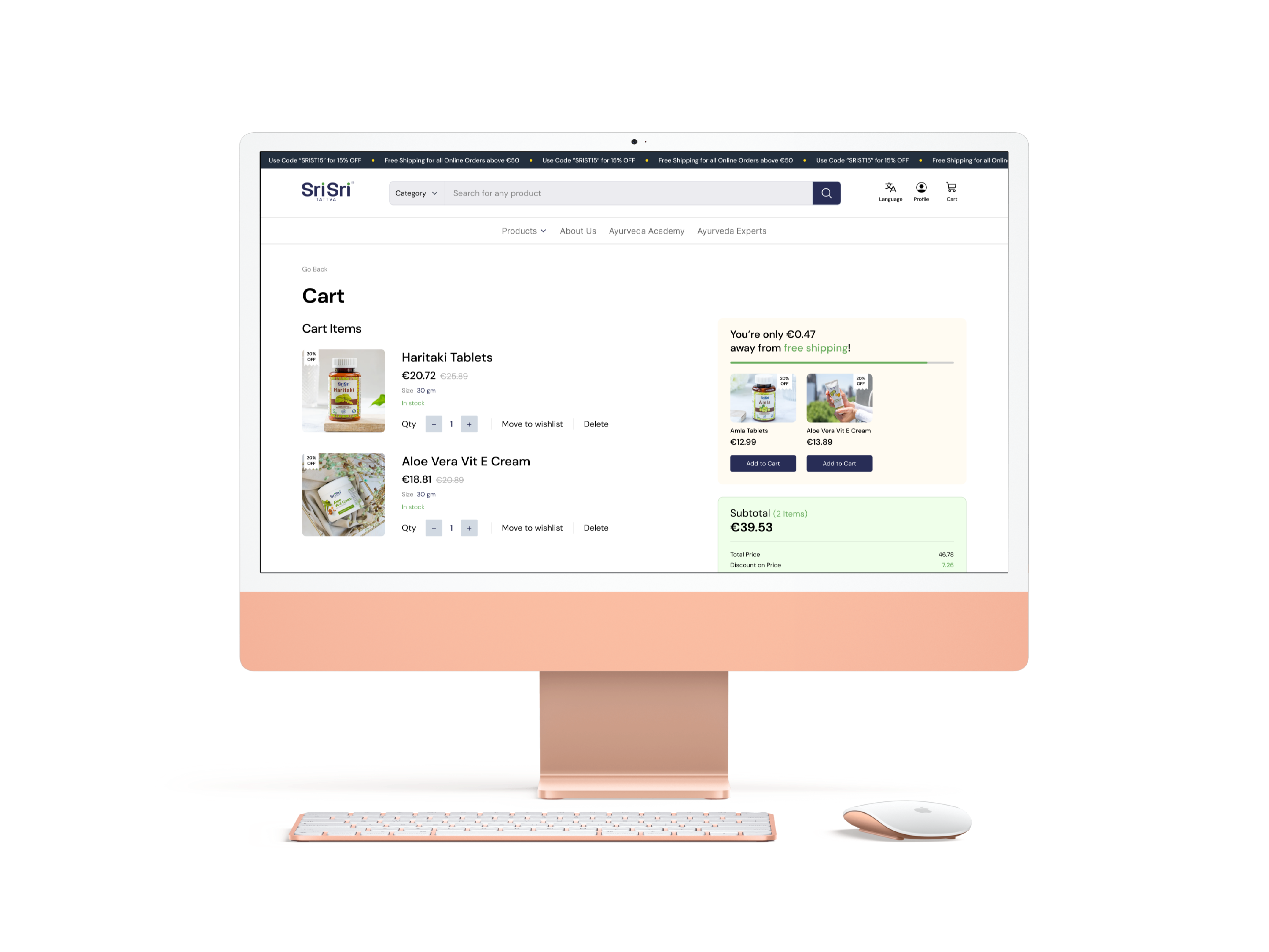
Users were facing several issues like cluttered design, small buttons, inconsistent fonts, lack of visual hierarchy, and poor image quality. A few more problems included a complicated checkout process, unclear error messages, inadequate cart summaries, lack of save-for-later options, missing shipping cost estimates

IMPROVEMENTS

  1. Larger Buttons and Links

  1. Clear Visual Hierarchy

  1. Consistent Font Sizes and Styles

  1. Comprehensive Cart Summary

  1. Save for Later Option

Additions

Designed New Sections

MORE LIVE EXPLORATIONS

These include more sections that were newly designed and will be live in the brand's website going on forward.

To view full case study, open this in web!

To Discuss further about the project, reach out to me at